Porrima
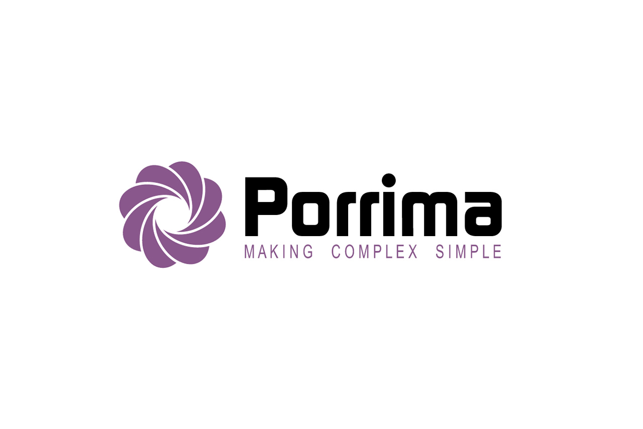
Brand identity for Porrima, a company based in Manchester that provides proposal and tariff analysis solutions for the telecoms industry. Established for nine years, Porrima felt their old logo was dated and wanted to go back to the drawing board.
Branding
Print

Visual identity
Porrima has developed some of the most advanced proposal and tariff analysis systems available to the UK telecoms industry. In reflection of this, they wanted a unique identity to represent what the company is all about - making complex simple.
Simply unique
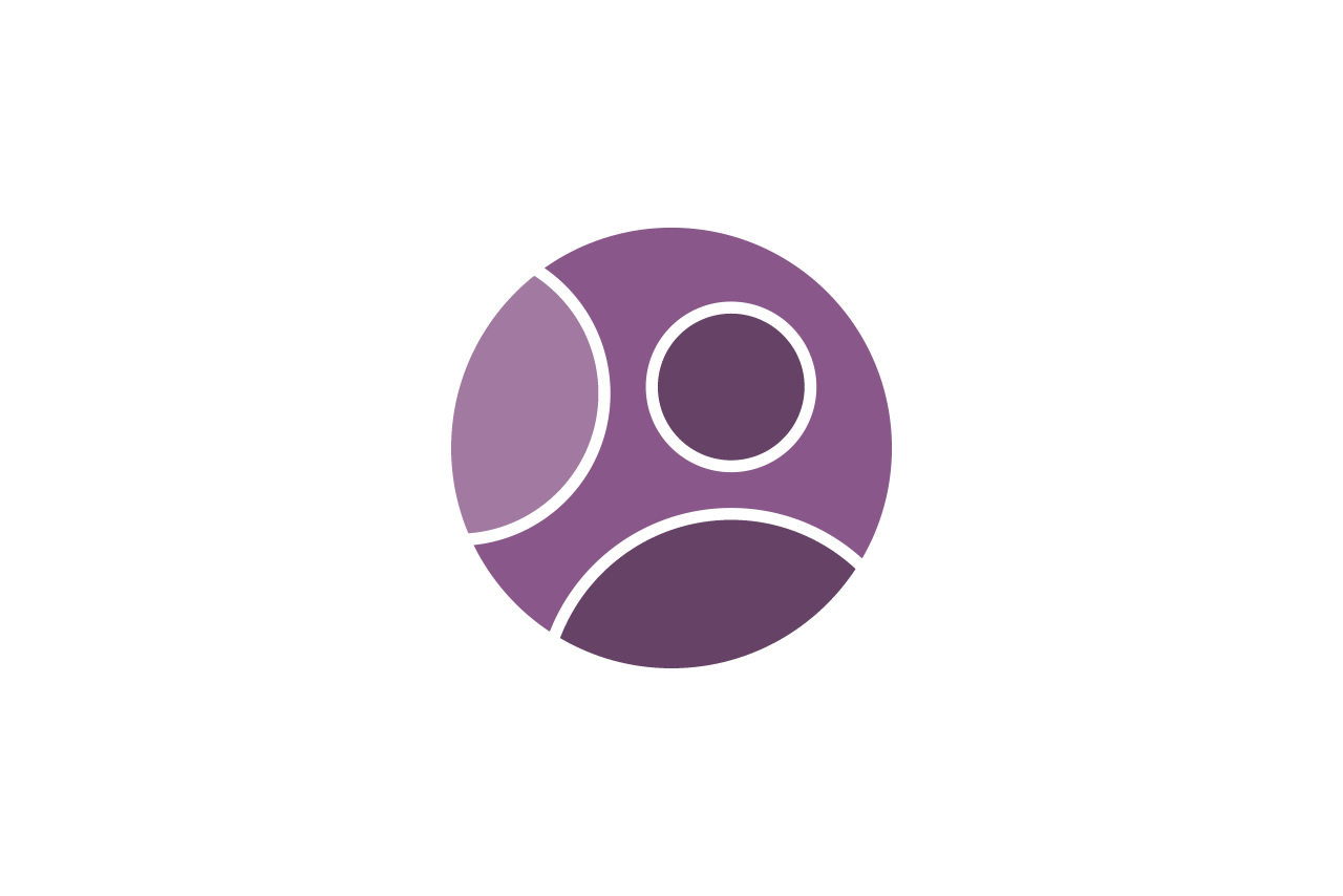
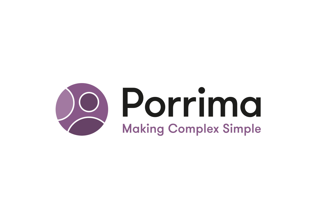
The symbol represents the company's process involving Porrima, their client and the consumer. Shades of purple highlight two figures, appearing at 45° angles within the icon, which combine to create a third figure with arms outstretched. A nod to the idea that putting heads together will result in a better solution.

Clear connection
The circles within the icon create shapes of the letters P and o, connecting perfectly with the logotype.

Clear space
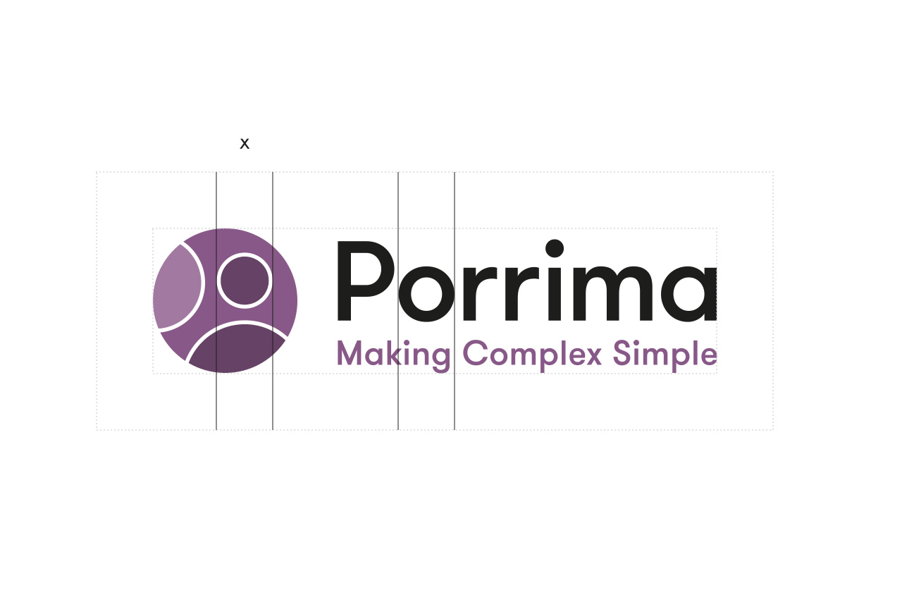
The clear space around the logo has been set at an x-height which relates directly to the width of the circle within the icon and the letter o of the logotype.

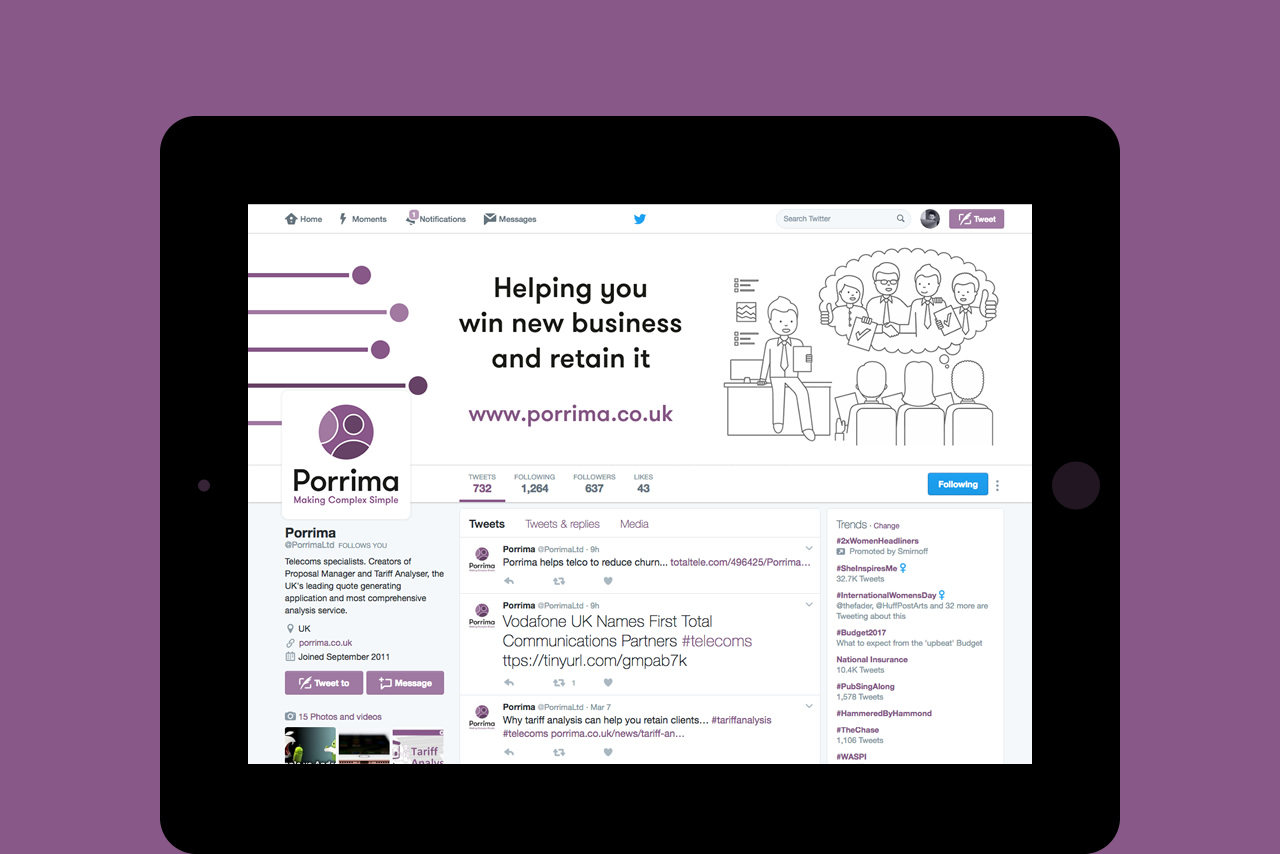
Social media
I designed a series of eye-catching graphics to enhance the Porrima brand across social media platforms.

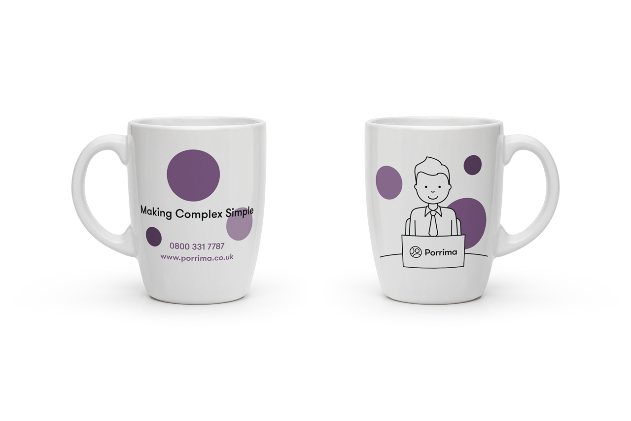
Promotional items
I designed a collection of promotional items, including mugs and mouse mats, to promote the new brand to new and existing clients.

Creative design
The new identity portrays Porrima's progress and will help it to become a recognisable brand within the industry. The result is a friendly yet professional brand which tells the company's story.



If you want to work together on a design project, speak to me on 07539 619426 or email hello@gadesign.co
